

CASE STUDY
General George Still House
Located at one of the highest elevations in Western Kentucky, this distillery project in Rough River is more than just a new bourbon label. It is a celebration of Kentucky heritage, craftsmanship, and storytelling. The client approached us with a unique opportunity: to build a brand from scratch on land once owned by George Washington, General Lafayette, and Henry Lee, the father of Robert E. Lee. Their vision was clear, create a brand that honors this rich legacy while establishing a destination worthy of the Bourbon Trail.
Our task began with naming the distillery, drawing inspiration from the land's historical roots. We then developed a full identity system including a brand board, logo suite, label designs, and bottle concepts. The aesthetic direction leaned away from modern trends and toward a rustic, old-world feel that reflects the authenticity and tradition of Kentucky bourbon.
The client emphasized a deep commitment to being "Kentucky Proud," sourcing natural ingredients locally and considering a custom still built entirely within the state. With a strong farm-to-bottle philosophy and a focus on craftsmanship, the brand aims to reflect the values and pride of its region.
With the goal of becoming a sought-after stop for bourbon tourism between Radcliff and Elizabethtown, the distillery is being positioned as more than just a producer of spirits. It is envisioned as an experience rooted in place, patriotism, and timeless whiskey-making tradition.

Background Research Recap
In the spirits world, a customer will buy a bottle because of one of four main reasons: packaging, quality, price point and the story. In the state of Kentucky, there are various distilleries that have created their own stories and it is time to add a new story to the forefront. The bourbon industry, for example, is already well established, continuing to strive even in a post-COVID economy. According to the Associated Press (2021), the combined sales of bourbon and whiskey in the United States over 2020 (the height of the COVID pandemic) was $4.3 Billion (up 8.2% from the previous year). In order to effectively tap into this growing industry, establishing a strong brand story and identity from the beginning is crucial. According to an article from Applied Adhesives (2020), focusing a brand around a story makes a brand “22% more memorable than your counterparts”. Creating a memorable story will keep the target market of Bourbon Trail consumers engaged and “buying in” to the products this distillery will have on the shelves.

Naming the Distillery
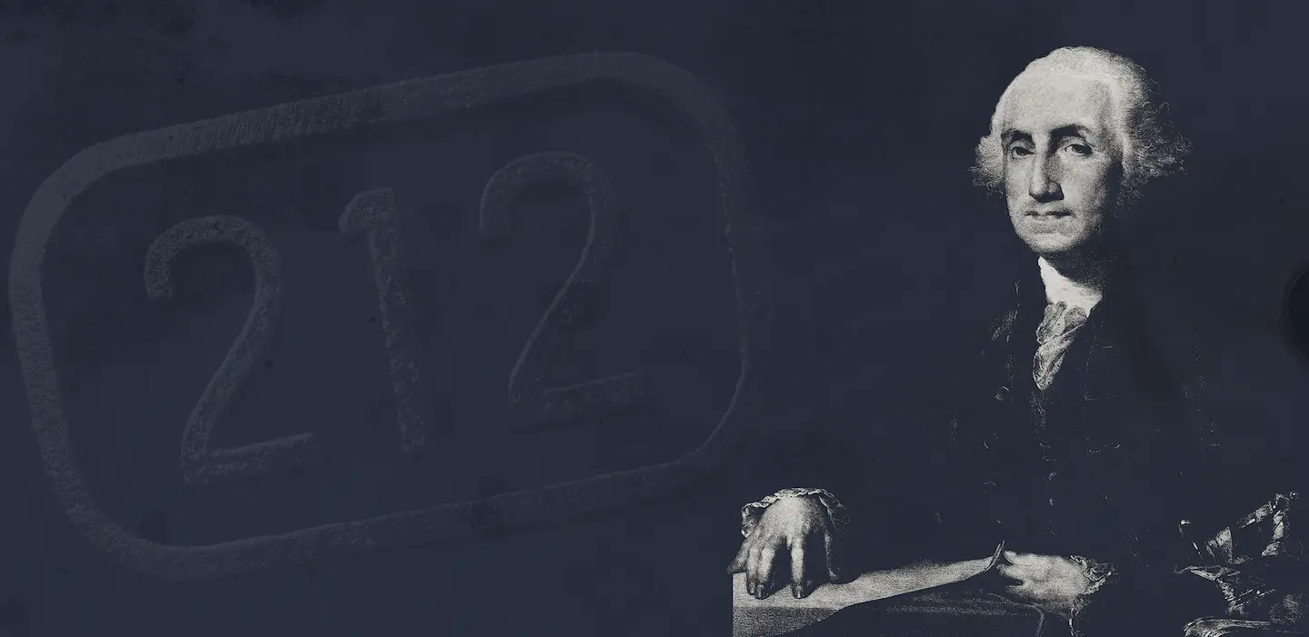
After narrowing down the criteria and analyzing the different ties to the distillery’s location, our team proposed the name General George Stillhouse for branding and tourism purposes. The choice to move in the direction of historical figures was driven by the opportunity present to capitalize on Washington’s land ownership in the state of Kentucky as many consumers are unaware of his land ownership in the state.
The decision to refer to Washington as “General George” instead of his first and last name allows for the distillery to tap into the notoriety of the Washington namesake, while also showcasing those leadership qualities in his role as General during the foundation of this country. Tying a brand name to a strong individual will aid in the chances of being memorable, leading the consumer through the stages of the purchase funnel from awareness, to engagement and ultimately a conversion/sale.
Instead of a distillery or distilling company, our team also decided to call the distillery a “stillhouse”. Although all three words/phrases mean the same thing, we decided to use “stillhouse” in order to be unique compared to the other stops on the Bourbon Trail, which all use distillery or distilling company in their name. This, in combination with the George Washington imagery, creates a basis for a unique brand identity and story that will entice the future consumers of the brand.

Logo Design
The logo for General George Stillhouse reflects a careful fusion of Kentucky heritage, historical reverence, and visual distinction in a saturated bourbon market. Built around the core brand story of George Washington’s land ownership in Rough River, Kentucky, the identity leverages both the power of a nationally recognizable name and the spirit of local craftsmanship. The logo plays a critical role in anchoring this story.
The logo’s ornate, vintage typographic style is intentionally reminiscent of early American signage and bourbon ephemera. Decorative flourishes and serif letterforms convey a sense of prestige and age, suggesting a legacy brand rather than a newcomer. By referring to Washington as “General George,” the identity achieves familiarity while maintaining historical gravitas, inviting the consumer into a first-name basis with a legendary figure. This approach avoids the clichés of patriotic branding while still harnessing its emotional resonance.
The color palette of deep navy, parchment cream, and hints of brass suggests aged paper, copper stills, and refined bourbon tones. These elements evoke trust and tradition, while the composition ensures legibility at both large and small scales. The symmetrical balance of decorative and typographic elements supports a sense of authority and heritage, qualities critical to appealing to both Gen X and Millennial bourbon enthusiasts who value authenticity and innovation.

Package Design
The General George Stillhouse packaging strikes a bold balance between historical depth and shelf appeal, offering a refined visual experience that reinforces the brand’s core narrative: a bourbon rooted in Kentucky land once owned by George Washington, distilled in the modern spirit of craftsmanship and legacy.
The typography and embellishments nod to early American engraving styles, evoking a vintage feel without appearing dated. Copper accents, layered over a navy-blue field, lend warmth and sophistication, tones often associated with aged bourbon and copper stills. The palette is cohesive with the brand’s historical motif and instantly telegraphs premium quality.
The neck label and top cap seal complete the premium impression. The batch number (023) hints at small-batch authenticity and future collectibility. The monogrammed “G” crest adds consistency across components, reinforcing brand identity on all sides of the bottle, even when viewed from above or behind the bar.
This packaging direction doesn’t just hold bourbon, it tells a story. It invites consumers to feel a connection to history, place, and process. Every detail, from typography and color to bottle shape and tone of voice, has been crafted to convey that General George Stillhouse is more than a drink. It’s a declaration of Kentucky pride, a tribute to American grit, and a toast to enduring tradition.
This packaging is poised to stand out on shelves, engage consumers emotionally, and earn loyalty through both visual distinction and meaningful storytelling.

From Research to Real
From initial research to final packaging, the General George Stillhouse project showcases a comprehensive and intentional branding journey. Beginning with in-depth exploration of regional history and bourbon culture, the project established a strong conceptual foundation that informed the name "General George", a title evoking legacy, strength, and Southern tradition. This identity was carried through into a bold, historically nuanced logo design that balances authority with artisanal charm.
The final packaging reflects the full narrative arc, marrying form and function with rich textures, elegant typography, and storytelling elements that set the product apart on the shelf. Together, these components create a cohesive and compelling brand that honors the past while appealing to a modern audience, exemplifying the power of design-driven strategy in building an authentic product experience.
Have an idea for your next project?
We’re here to turn your ideas into success.